The Fill and Border tab holds the controls that define how the individual symbols are drawn. The controls are grouped into three sections.
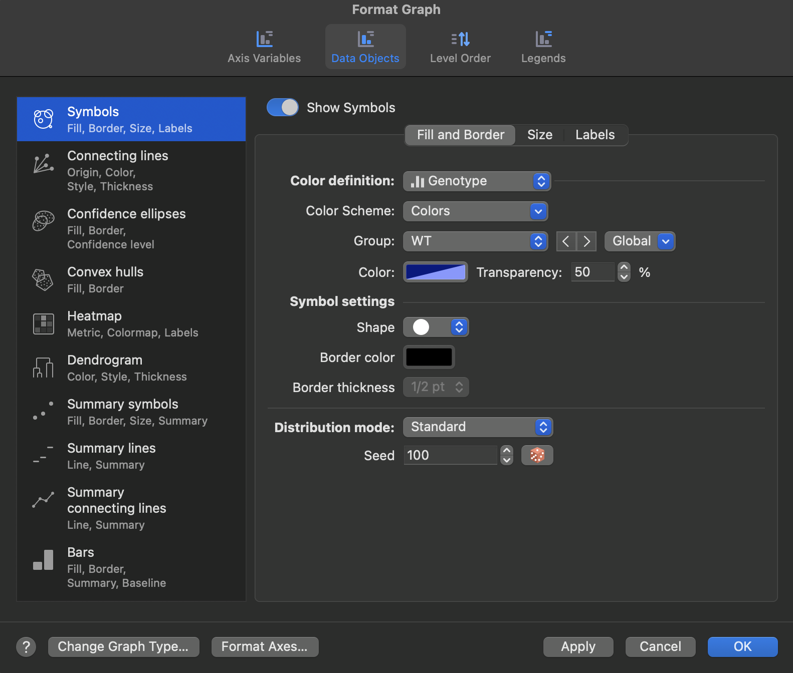
Color definition
The Color definition dropdown determines what drives symbol color. The controls shown beneath it depend on which choice you make.
•A single color: one color and transparency value is applied to every symbol on the graph.
•A variable: symbol color is driven by a variable from the data table, which may be categorical or continuous. Additional controls appear for the Color Scheme, and for selecting a Group so that you can set the Color and Transparency of one level at a time. The Global dropdown beside the Group selector lets you apply a change across levels at once.
The color options are covered in full on a separate page.
•Color definition options: choosing a single color or a variable, and working with colormaps.
•Border: border color and thickness options.
Symbol settings
The Symbol settings section controls the appearance of the symbol itself:
•Shape: choose from Prism's standard symbol shapes, or select a custom character from any font installed on your computer.
•Border color: the color of the symbol outline.
•Border thickness: the weight of the symbol outline, in points.
Distribution mode
Distribution mode appears when one axis is assigned a categorical variable. Every row of data belonging to a level is plotted within that level's segment of the axis, and this option controls how those symbols are arranged within the segment so that overlapping points stay readable. Four choices are available:
•Aligned: all symbols are aligned along a single line down the middle of the lane, with no horizontal spread.
•Standard: the width of the distribution of points is proportional to the number of points at that value, giving an arrangement similar to a violin plot. This is the best choice for showing the shape of the distribution.
•Expanded: prioritizes minimizing overlap between individual points rather than representing the shape of the distribution. Points in sparser regions are spread out, without producing “smiles” in the data.
•Classic: also prioritizes minimizing overlap, and may produce “smiles” in the scatter, matching the appearance of scatter plots in older versions of Prism.
With a small number of points the modes look nearly identical. The differences become clear as the number of points grows. These are the same arrangement methods used for classic Column and Grouped scatter plots, described in more detail under Three ways to plot Column or Grouped scatter plots.
Standard, Expanded, and Classic place points using a random component. The Seed value controls that randomization, so the same seed reproduces the same arrangement. Change the seed, or use the button beside it, to generate a different arrangement of the same data.